


mpm gin packaging
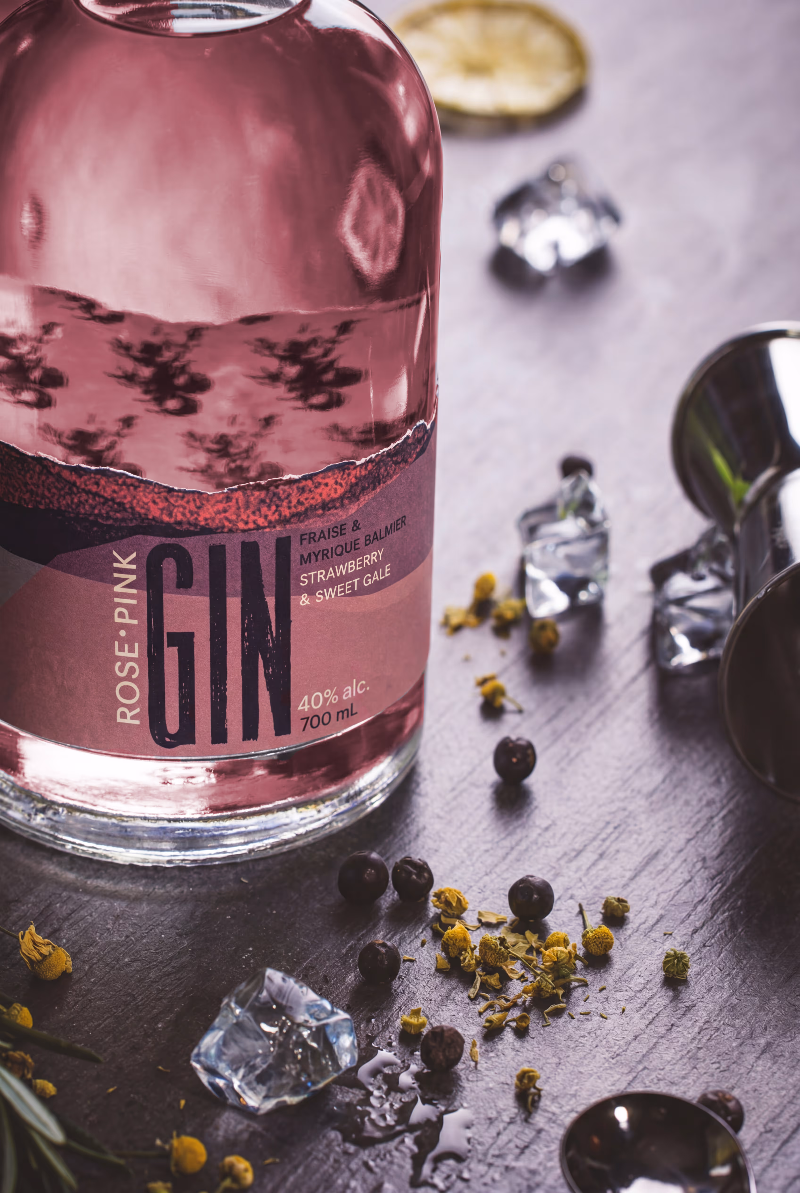
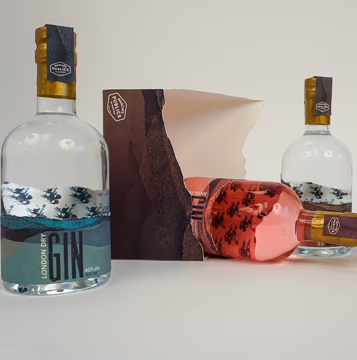
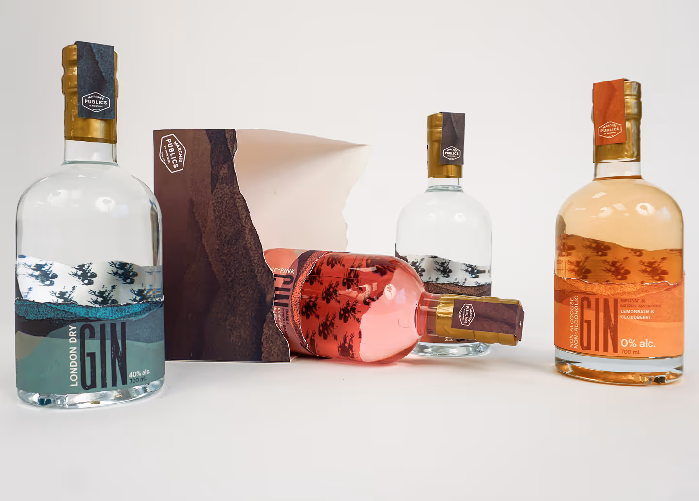
Crafted from botanicals sourced at the Jean-Talon, Atwater, and Maisonneuve Markets, the goal is to create a cohesive brand and packaging system that reflects Québec’s landscape and craftsmanship, aligned with MPM’s identity and appealing to eco-conscious consumers.

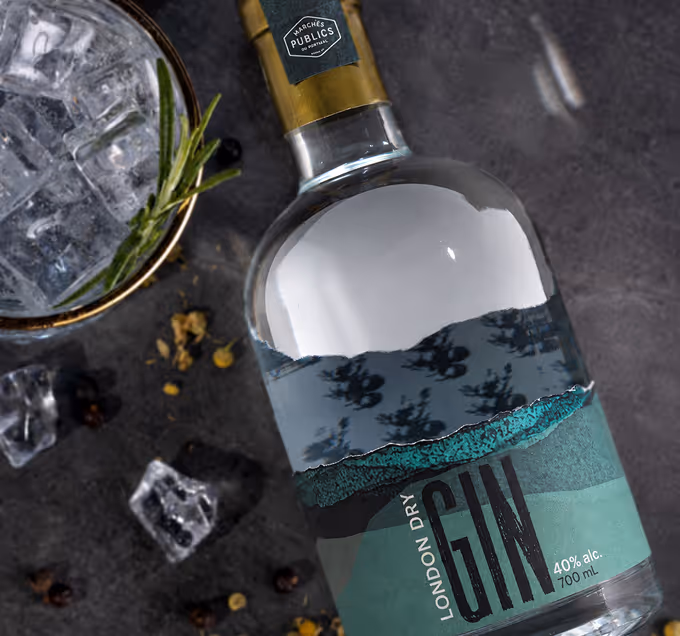
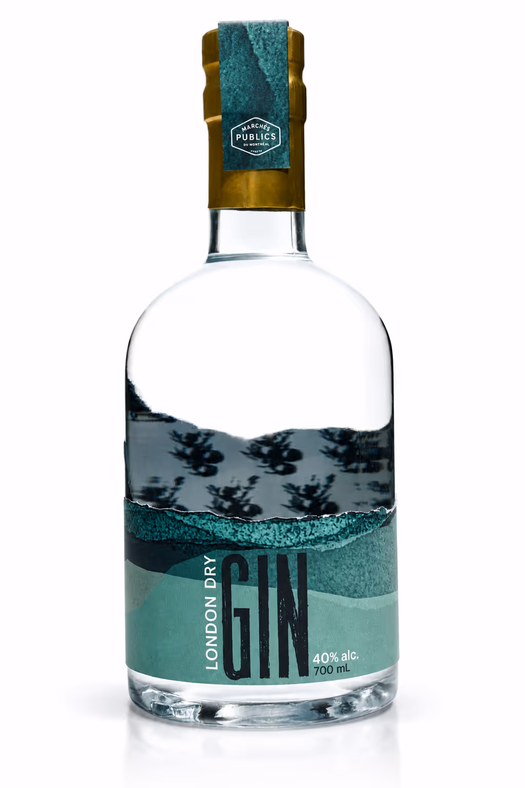
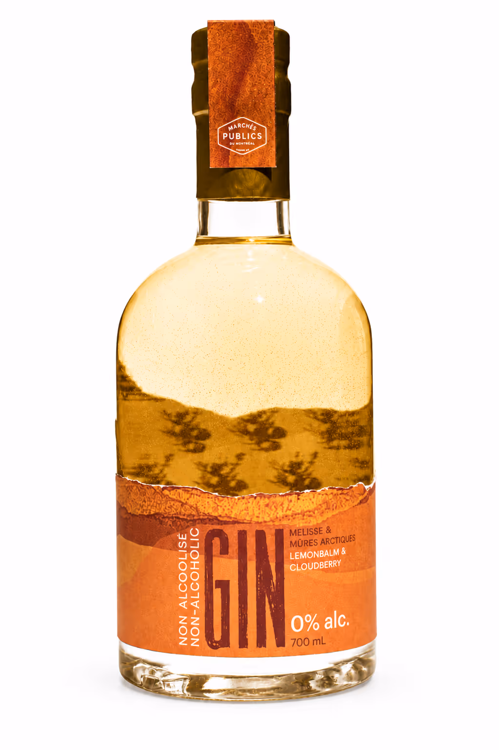
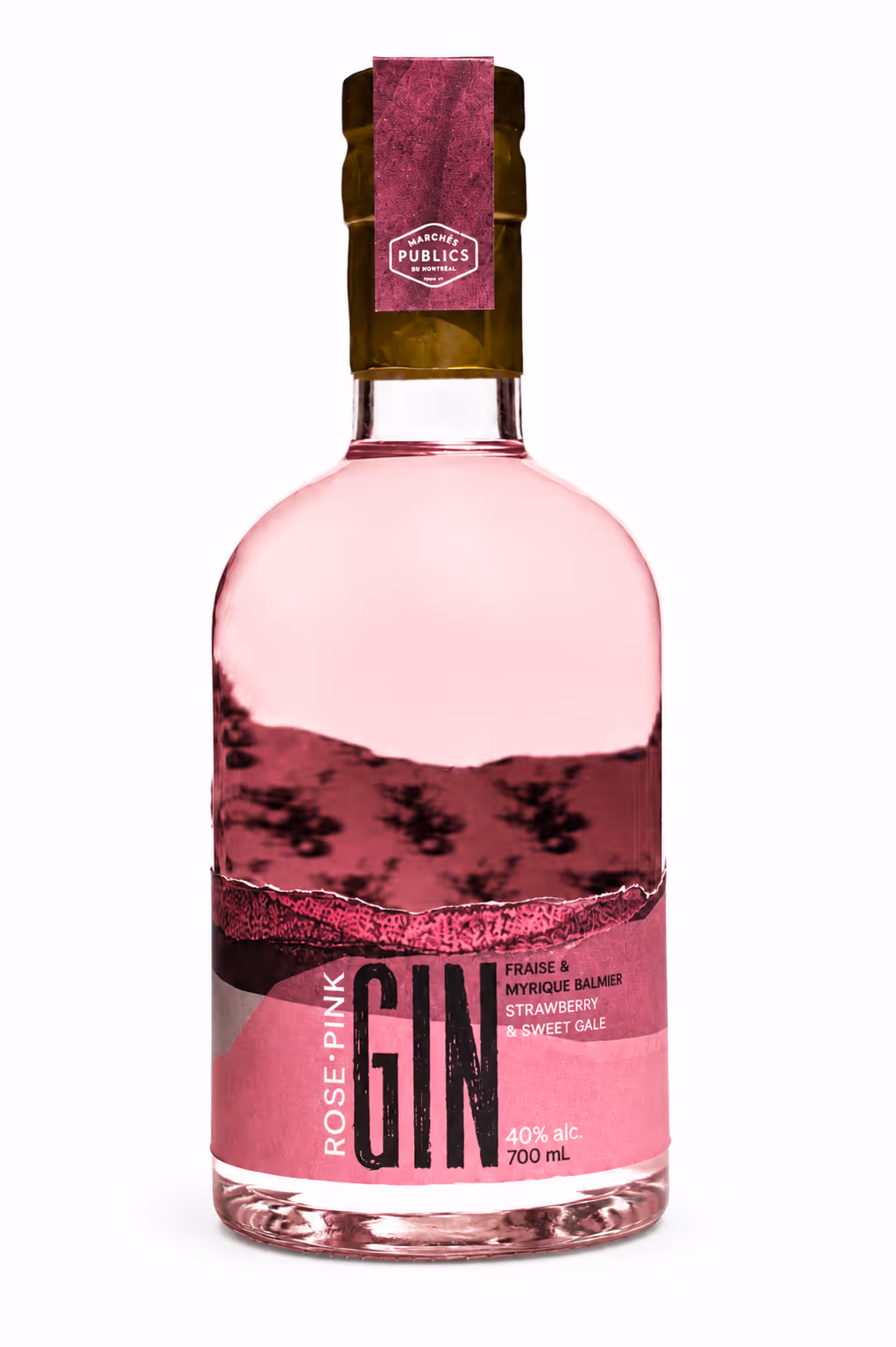
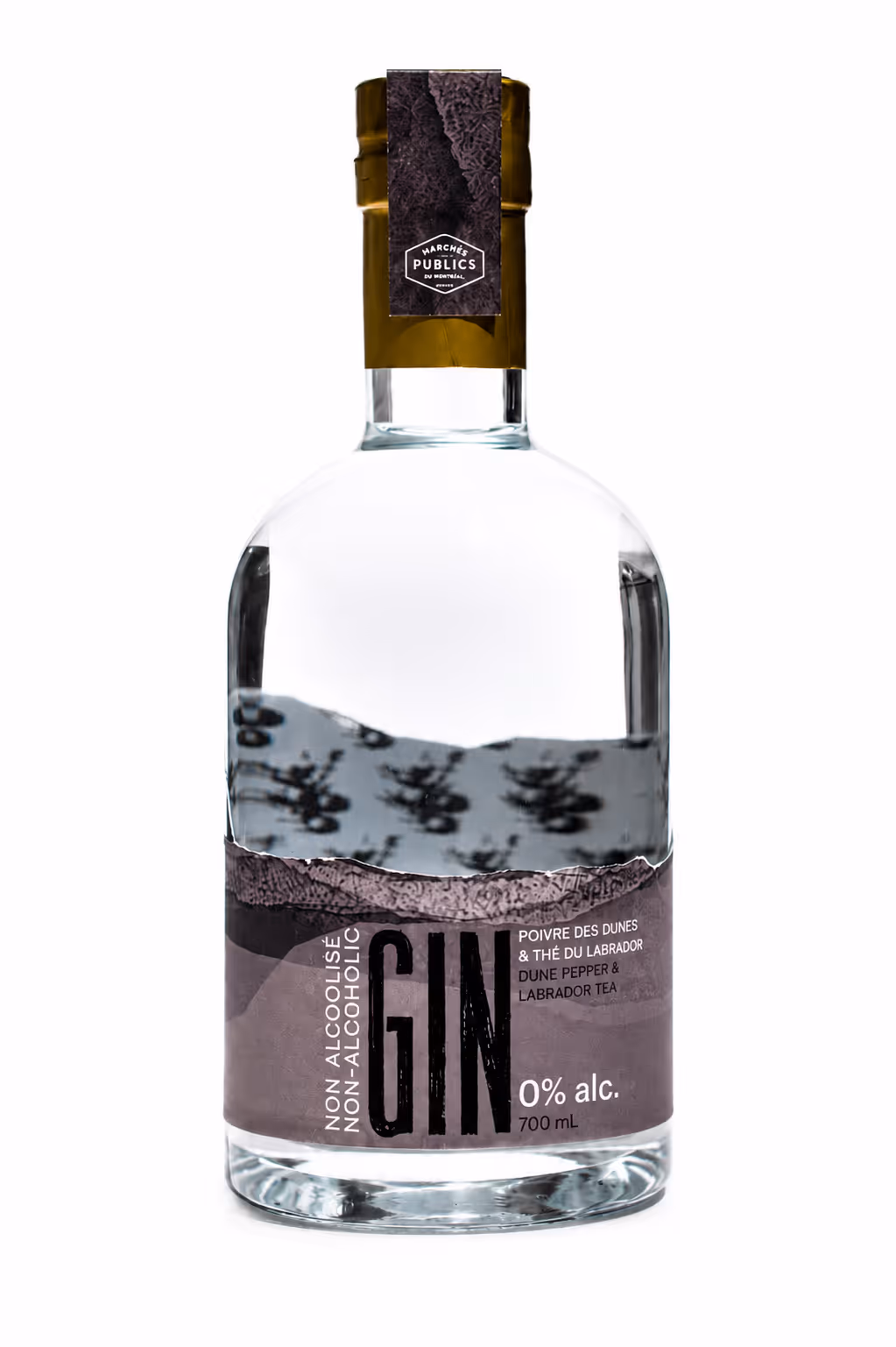
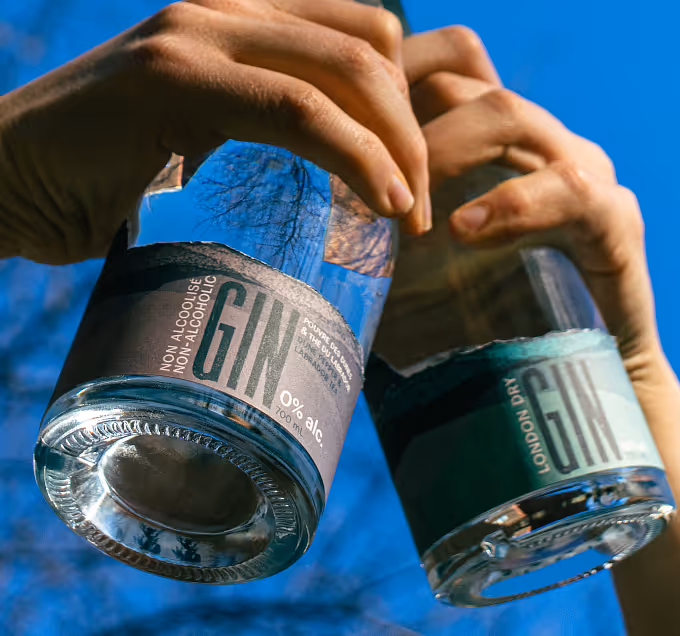
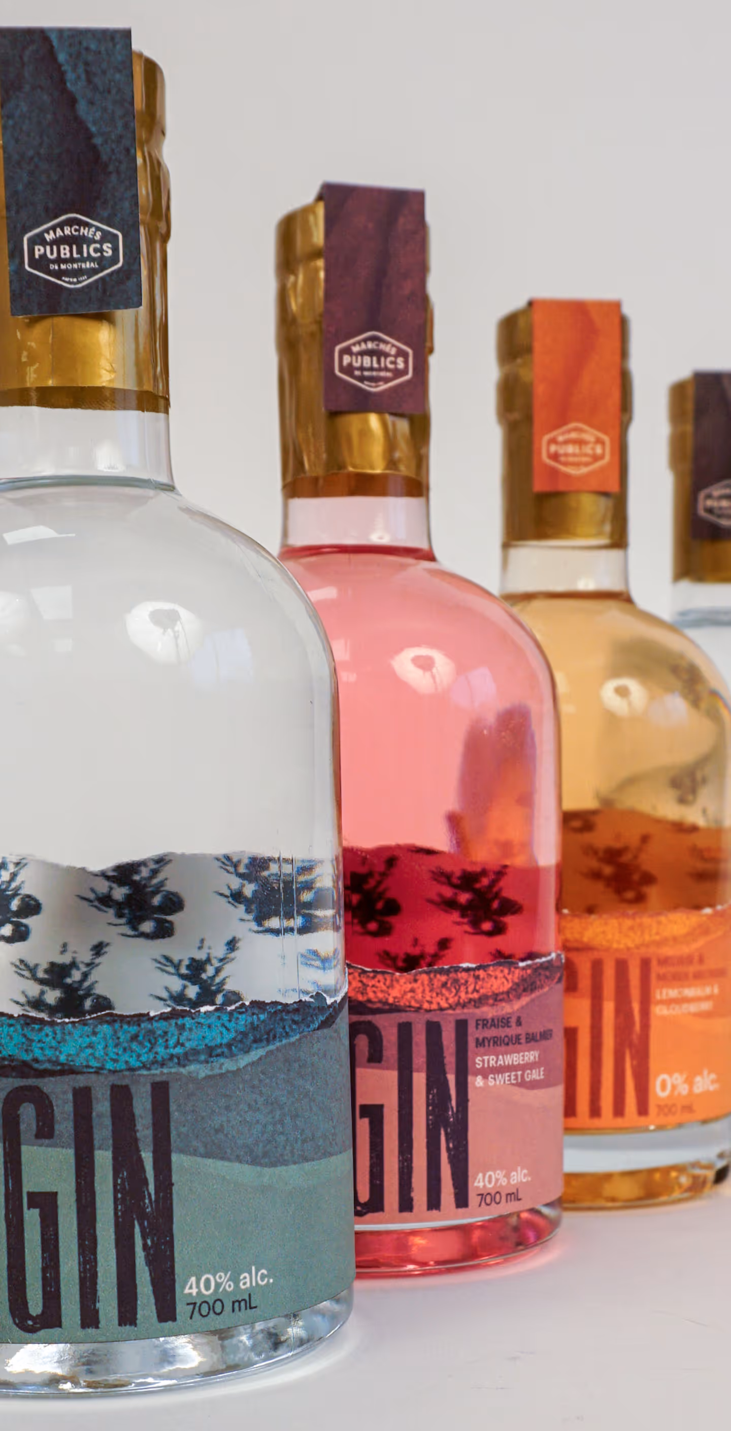
My approach was to move beyond “local” in a saturated Québec gin market by creating a design that feels raw, tactile, and grounded in place. The low-set, tapered label echoes how juniper grows close to the ground, revealing an illustrated pattern that symbolizes transparency and provenance.
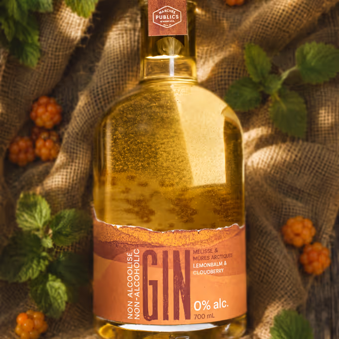

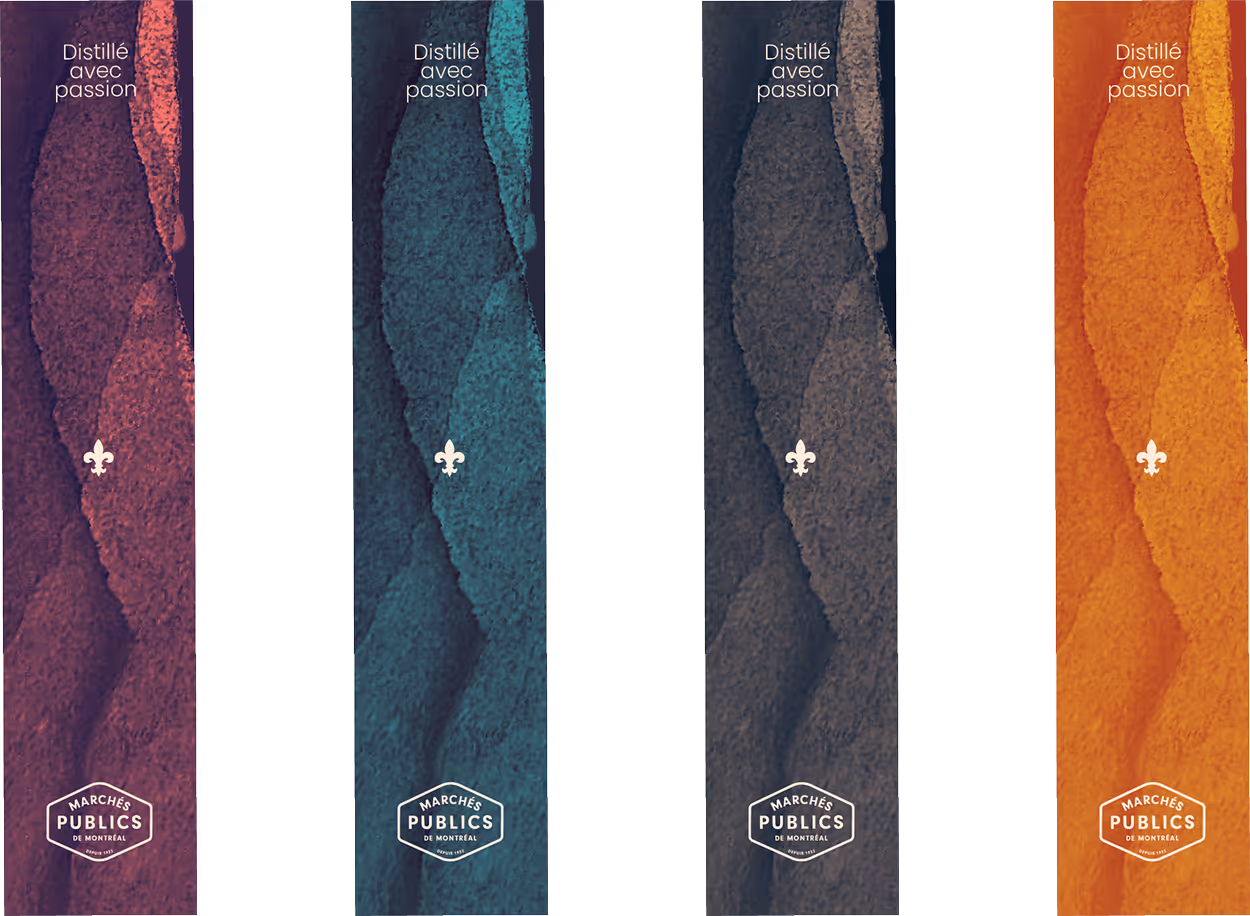
Ripped parchment textures were scanned and refined digitally to create depth and tonal cohesion. Illustrated berries wrap from back to front in a continuous loop.
Each variant carries its own color, distinct but unified. The collection expanded from three to four products, including a non-alcoholic option, and is housed in a custom-designed box set that presents the line as a complete, gift-worthy system.
Credits
Photography
Olena-Bohovyk (unsplash)
Kristen Munk (unsplash)