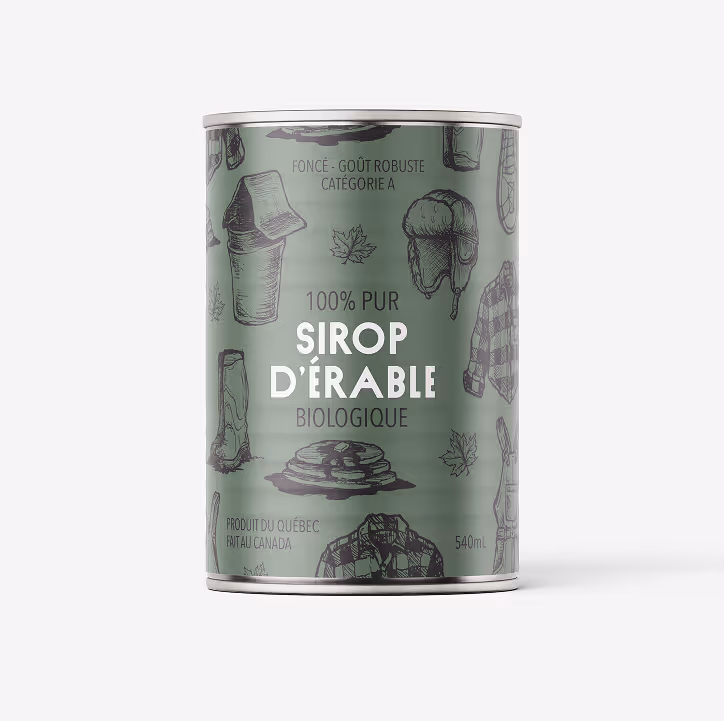
MAPLE SYRUP PACKAGING
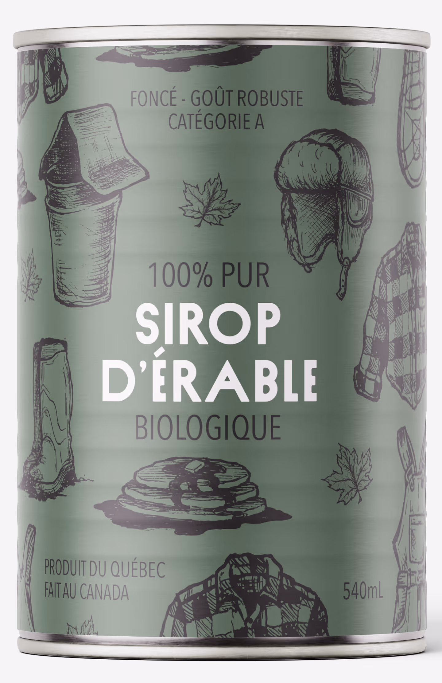
This project reimagines the traditional maple syrup tin to communicate organic certification while preserving its cultural significance. The goal was to create packaging that could stand confidently beside sleek glass bottles while feeling premium, gift-worthy, and relevant to both local and global audiences.
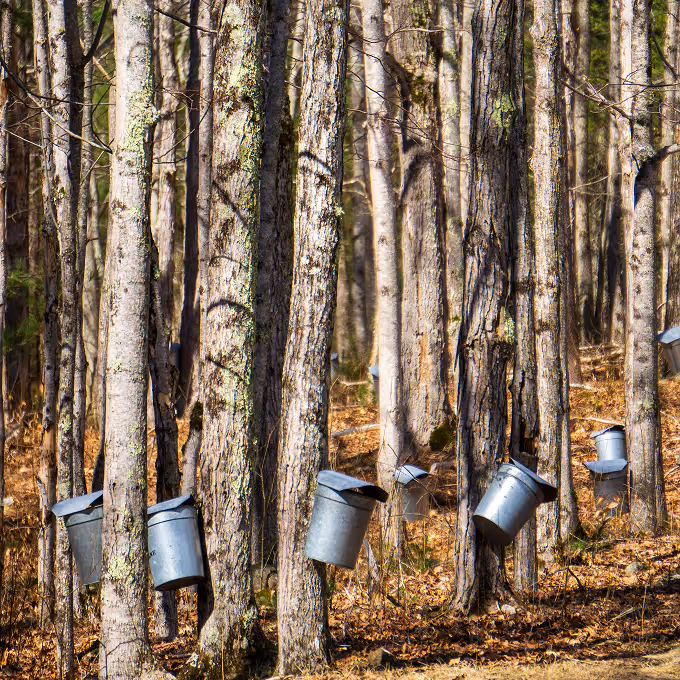
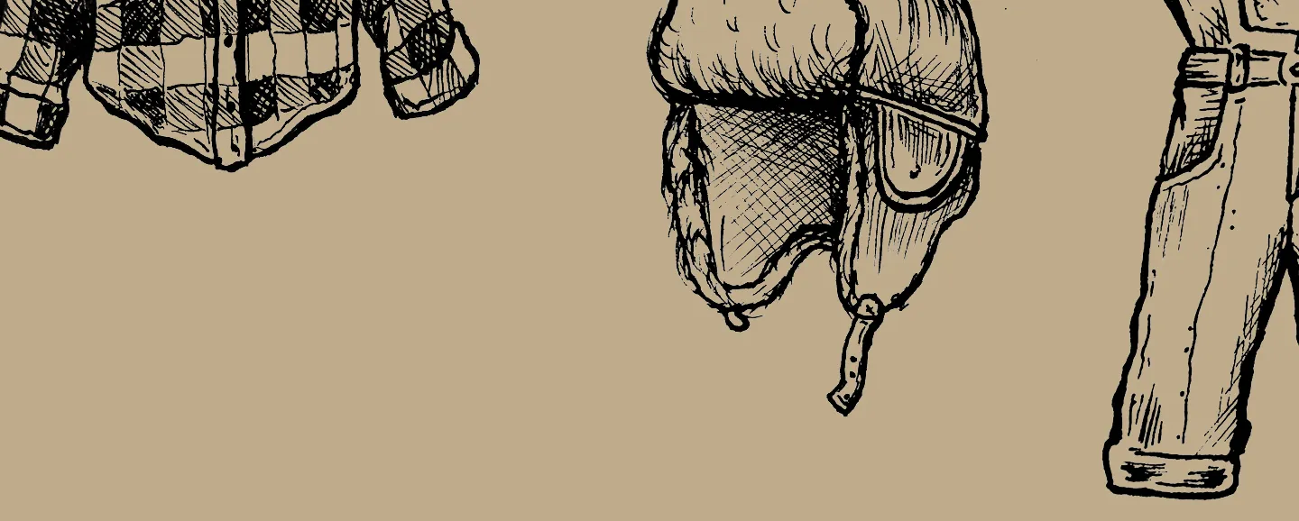
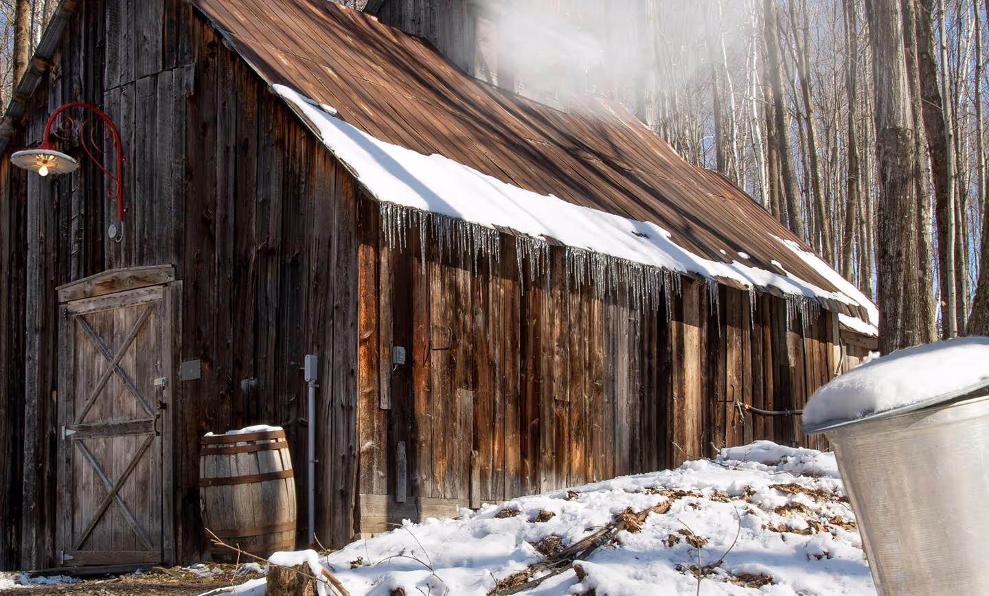
Rather than abandoning the traditional tin format, I chose to modernize it. I explored the tension between nostalgia and contemporary visual language, identifying an opportunity to elevate the tin through illustration and hierarchy. Inspired by maple farming and Canadian cultural symbols — flannel, overalls, snowshoes, sap buckets — I developed a bold illustrative system arranged like a tattoo flash sheet. This composition celebrates identity while introducing a graphic edge that feels current and collectible.
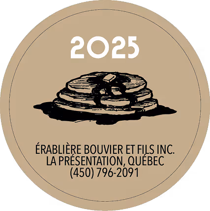
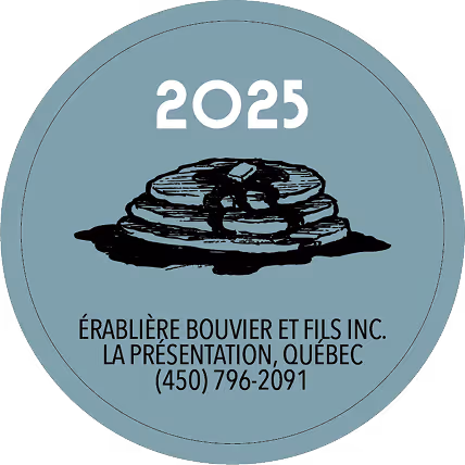
The final design retains the recognizable cylindrical tin but transforms its surface into a striking, high-contrast wrap. Organic certification is integrated confidently within the hierarchy, ensuring clarity without disrupting the visual impact. The result is a culturally rooted yet globally relevant package — one that honors Québec’s maple syrup legacy while redefining it for a modern, design-conscious audience.
Credits
Photography
Albert Laurence (unsplash)
Cole Kesiter (unsplash)
Patrick Tomasso (unsplash)
Alain Bonnard (unsplash)
Matt Bamard (pexels)
Mockups
mockups-design